Client
U.S. Department of Education
Agency
Fjord / Accenture Federal
Role
Design Lead
Launched
December 2019
Federal Student Aid, a part of the U.S. Department of Education, is the largest provider of student financial aid in the nation. They help make college education possible for more than 13 million students each year. The student aid experience was convoluted (they had more than 18 websites), and it needed to be completely reimagined–simple, supportive, and transparent. We created a website where students could learn about their options, apply for aid, make online payments, and track repayment progress all in one place.
Background
FSA hired Fjord and Accenture Federal Services to redesign the student aid experience–while satisfying federal legislation–so that we can help students and borrowers make smarter financial decisions. Our team was divided into three workstreams: Research, Design, and Information Architecture.
My role
I led the Design workstream, where I managed a 10-person team that focused on bringing FSA's many services and resources into a single place on studentaid.gov and improving on them. We also worked on increasing financial literacy at key moments during the customer journey. I was responsible for ensuring user experience and visual design quality, holding frequent 1:1s with designers, implementing and adapting our design process, facilitating conversations between designers and stakeholders, helping the team plan research and design activities, cross-collaborating with other leads, scoping and estimating work, overseeing design system creation and maintenance, and executing design when needed.
Our process
We followed an agile methodology and worked in fast-paced sprints, with each sprint lasting three weeks. We worked collaboratively with our clients and loan servicer partners at every stage–involving them in workshops, brainstorming and concept development, and usability testing. The design team regularly worked alongside strategy & innovation, research, business/functional, engineering, data, and content teams.
01 Discover
Activities:
Sprint kickoff, literature review, review user stories, stakeholder interviews
Deliverables:
Research report, current-state user flows
02 Design
Activities:
Concept development, workshops, tech ability reviews, content reviews, internal and client reviews
Deliverables:
Future-state user flows, annotated wireframes, high-fidelity prototypes
03 Test
Activities:
Usability testing, synthesis
Deliverables:
Usability report with recommendations
04 Deliver
Activities:
Finalize and prepare files, design-to-dev hand-off meeting
Deliverables:
Future-state user flows, high-fidelity prototypes, design documentation
Discovery
We spent the first few weeks learning as much as we could about federal student aid, the student aid lifecycle, customer needs and pain points, and client expectations. We interviewed FSA stakeholders and financial aid administrators, reviewed existing research literature, and studied FSA’s websites and web analytics. By the end of discovery, we were able to identify and prioritize key issues, break down a massive project into more manageable sprints, and get a head start at building a new design system.
Customer types
🤷🏻♂️
Student considering school
Planning for post-secondary education
Evaluating schools and academic programs
Learning about types of aid and repayment plans
Applying for student aid
🧑🏾🎓
Borrower in school
Renewing the FAFSA form annually
Completing loan counseling
Preparing to go into repayment
👪
Parent
Planning to pay for their child’s education
Learning about types of aid and repayment plans
Applying for student aid on behalf of their child
💸
Borrower in repayment
Makes monthly payments to loan servicer(s)
Looking into changing their repayment plan
Looking into consolidating loans
Trying to avoid defaulting on loans
Problem areas
Decentralized information
FSA offered myriad information and tools online, but it was spread across 18+ websites (including 9 loan servicer websites) which made it difficult for customers to complete important tasks and find what they needed.
Confused about who to pay
Borrowers manage their loan payments through third-party loan servicers–many borrowers having loans with more than one servicer. However, they do everything else (i.e. apply for aid, online counseling) through FSA. There was a major need to simplify the borrower’s experience by allowing them to make payments directly on studentaid.gov.
Lack of financial literacy
20% of federal student loan borrowers are in default. Because of that fact, it was crucial to increase financial literacy among students, parents, and borrowers so they could make more informed decisions and avoid crippling debt.
Inconsistent branding
The visual aspects of the brand were inconsistently applied across FSA’s websites and didn’t follow the most recent brand guidelines. In addition, loan servicers used their own branding which further confused borrowers about who managed their loans.
Federal student aid reform
President Obama’s 2015 memorandum on a Student Aid Bill of Rights to Help Ensure Affordable Loan Repayment directed that there should be “a simple process for borrowers to file complaints.” While FSA’s Feedback Center and Borrower Defense application already existed, we felt they could be improved. The memorandum also called for “a centralized point of access” for borrowers to manage and repay their loans, regardless of loan servicer. As a result, FSA partnered with our team and two loan servicers, Great Lakes and Nelnet, to create an online payment pilot on StudentAid.gov.
Two months after this project kicked off, President Trump issued an executive order on Improving Free Inquiry, Transparency, and Accountability at Colleges and Universities. It reinforced our goals of creating a single StudentAid.gov website and mobile app, increasing financial literacy, providing a comprehensive view of the customer’s aid summary, and allowing customers to calculate future loan repayment scenarios.
Design
A design system to ensure a unified and consistent brand
FSA had a brand style guide that had been followed on some websites, but not all. They didn’t have a design system or pattern library, so we had to start from scratch. We audited visuals and language used across 9+ of their websites and the FAFSA mobile app. We found inconsistent usage of brand visuals, user interface elements, design patterns, and language.
It was essential to involve the client at this point because they had background knowledge of previous design constraints, technical limitations, and business rules that informed why some patterns were the way they were. This collaboration was especially valuable when it came to auditing the FAFSA website and mobile app since there were many patterns only used there and nowhere else.
After sorting through FSA's varying content and functional needs we identified which styles, components, and patterns could be simplified and shared between the website and mobile app. Components and patterns that needed to remain specialized and distinct were documented as such in the design system. We documented these styles and usage guidelines using Invision’s Design System Manager, which made it easy to share the design system with other teams and our clients.
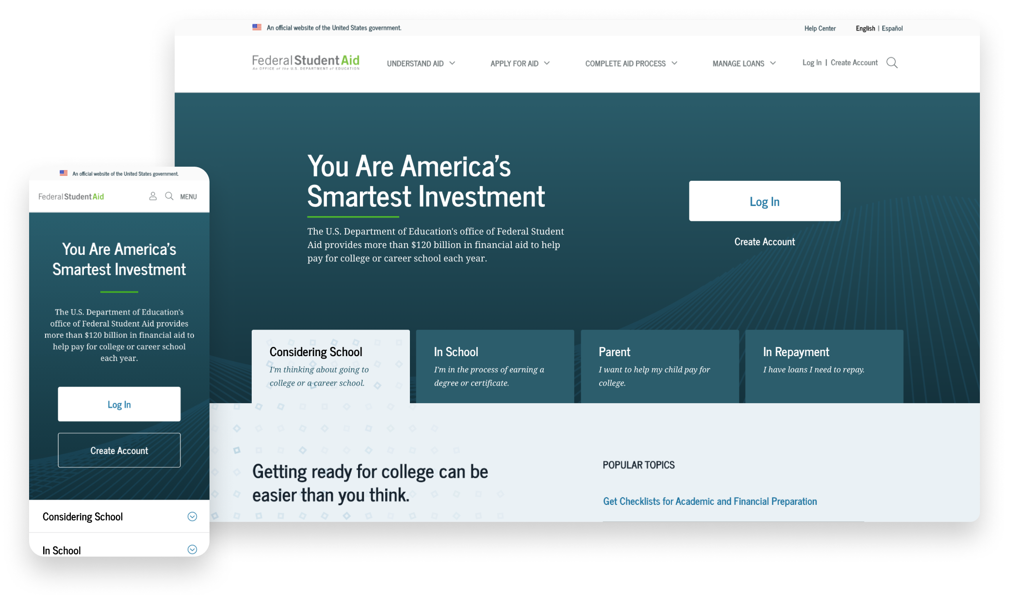
A single website to manage all things student aid
We eliminated the guesswork of customers having to figure out which website they needed to visit by consolidating all of FSA’s websites into one. Customers also had to visit a separate website (one for each loan servicer) to make payments and manage their repayment plans. Learn more about how we integrated payments into the new website later in the case study.
Single point of access
It wasn't immediately clear that the login credentials (known as an “FSA ID”) customers used on FSAID.ed.gov were the same ones they could use on other FSA websites like FAFSA.gov, StudentAid.gov, NSLDS, and others. Since these were physically different websites, customers had to log in multiple times if they wanted to change their password, fill out the FAFSA, complete loan counseling, or use the online tools. We eliminated these obstacles by consolidating all of the FSA websites into a single StudentAid.gov website.

Customers can now sign into a single website to manage their aid, fill out the FAFSA, change their password, and more.
Information architecture
We organized the site’s information architecture by stages of the student aid lifecycle to make navigating the student aid process–and the site–more intuitive. The four stages of the student aid lifecycle are: understand aid, apply for aid, complete aid process, and manage aid.
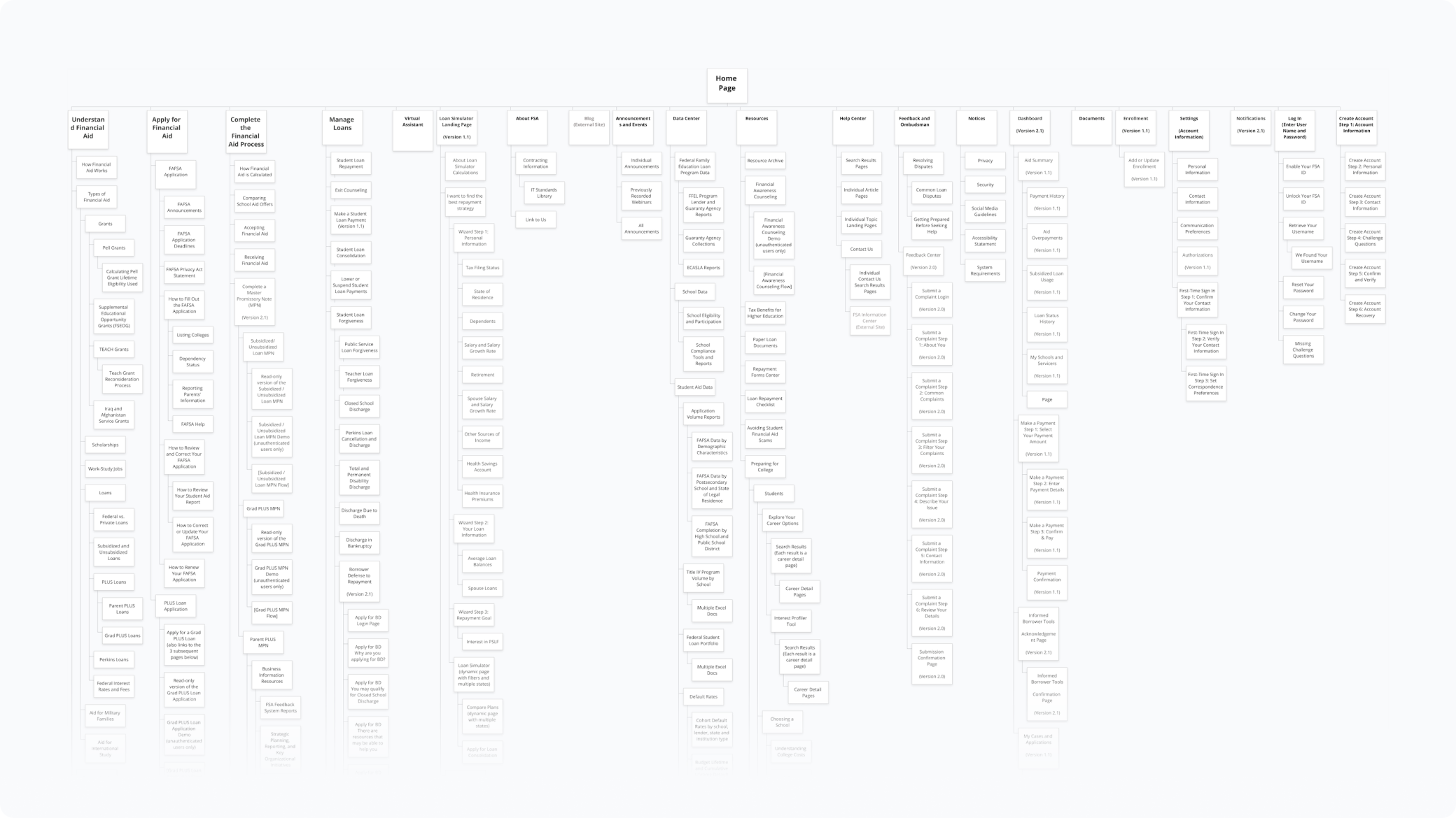
The new StudentAid.gov website now includes content from StudentAid.gov, StudentLoans.gov, FAFSA.gov, FSAID.gov, Feedback.StudentAid.ed.gov, MyEdDebt.ed.gov, BorrowerDischarge.ed.gov, DisabilityDischarge.com, and NSLDS.
settings & preferences
Each of the former websites had its own site settings and communication preferences customers could customize. Since all the websites were being combined, we had to consider what would happen to these features. For both Settings and Communication Preferences, it was a simple task to group like controls together.
A personalized, proactive dashboard that keeps you on track
The process of applying for and receiving student aid is long and can feel overwhelming. It’s common for customers to miss deadlines, provide incorrect information, and get lost in the process. We designed the dashboard to give them a snapshot of their aid summary, include checklists for each of the stages in the student aid lifecycle, and remind customers of important upcoming deadlines.
A comprehensive, data-rich student aid summary tool
If a customer wanted to view their balance, see the breakdown of principal and interest, and view all their loans and grants they previously would have had to check in two places: studentaid.gov and NSLDS. Now customers can can monitor repayment progress, receive alerts about their account, and keep track of their remaining eligibility for Direct Loans and Pell Grants in a single location. The aid summary tool also tracks the number of qualifying payments they’ve made to the Public Service Loan Forgiveness (PSLF) program.
A single place to manage payments, regardless of loan servicer
FSA contracts out the administration of loan payments, repayment plans to nine loan servicers. Customers previously had to remember who their loan servicer(s) was, and log into their correct website(s) to make payments and modify their repayment plans. We designed a pilot program to allow borrowers with loans managed by Great Lakes and Nelnet to make standard monthly payments directly on StudentAid.gov.
Prioritizing financial literacy throughout the student aid journey
The most complex feature we built to solve FSA’s financial literacy problem was the Loan Simulator. It’s an interactive tool that helps customers find the best repayment strategy based on their unique needs and goals. Customers are guided through questions about their income, tax situation, desired loan amount, and repayment goals. The tool calculates their repayment plan type (including pros and cons), estimated monthly payment amount and end date, and other relevant options to consider.
Better tools for finding help and improved customer service
Since we combined many of FSA’s websites into one, customers can easily find what they need through the site’s comprehensive search functionality. We also created an organized way to find information and get answers through the Help Center. The Help Center pulls information from a Salesforce database, where we categorized content by intuitive topics such as Getting Started and Completing the FAFSA Form. Also, we featured the top ten most common questions customers ask on the front page of the Help Center.

The new Help Center allows customers to find answers to their questions either by browsing help topics or searching FSA’s knowledge base.
Design
Rochelle Pennington, Vanessa King, Kelley McDonald, Drew Dick, Hanh Nguyen, Lauren Hudock, Shea Huening, Kelly Horigan, Leelah Holmes, Sam Braden, Cloyd Buenaventura, Ellie Mueller, Aaron Hill, Margie Currier, Stephanie Rubin, Caroline Burr
Research
Megan Soule, Earl Gray, Sarah Robertson, Camille Denardo, Hanh Nguyen, Luke Klavon, Stephanie Rubin
Leadership
Lauren Oliver, Jevaun Howell, Randy Rodriguez